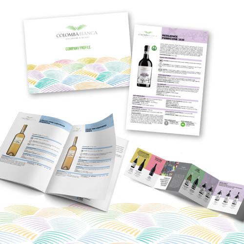
The new catalog collects the technical data sheets of Colomba Bianca wines full of information intended for those who are approaching a complete knowledge of the wines and presents itself with a new layout that offers a more attractive visual experience.
In fact, each line, from the Riserva Quarantanni to the Metodo Classico 595 bubbles, is characterized by its own colour, in order to make the wines personalized and easy to recall.
In order we will therefore see the FORTY YEARS dressed in bronze, a pastel pink for the PASS-ONE and two distinct shades of green for the still and sparkling wines of LAVÌ. The RESILIENCE line is colored purple, symbol of justice par excellence, followed by turquoise for VITESE, a color that traditionally recalls the capsule of the white wines of this line. The yellow of the PRINCE OF GRANATEY is accompanied by the orange of the 595, followed by the new Tiffany colour, the new MOUR sparkling wine. Finally, the LÈGADI selection is dressed in the color of the sea that surrounds the islands of the same name.
A play of colors that immerses you in the details. In fact, the same shades outline the hills of Sicily, a recurring element at the basis of our institutional materials, whose streaks return in the form of the green wings of a dove that we find at the summit. A strategic design that brings the company logo to life.
Sicily confirms itself, therefore, as the protagonist of Colomba Bianca’s communication which, rich in aesthetic value and diversity, sinks its colors into a real kaleidoscope of Sicilies, best represented by the quote from Gesualdo Bufalino in the masterpiece “The plural island” , chosen to tell the nuances and richness of our territory:
“There are so many Sicilies, I won’t stop counting them. There is the green Sicily of the carob tree, the white one of the salt pans, the yellow one of the sulphur, the blonde one of the honey.
Here everything is mixed, changing, as in the most composite of continents”.
Our institutional materials are created in Italian and English, with the aim of best responding to the international market.